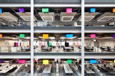
The TMT Sector: Anything But Traditional Ceiling Systems
Workplace design has been revolutionised. Since the Googles, Yahoos and Hubspots of this world concluded that attracting talent meant making their workspaces fun nothing has been quite the same – and that goes for ceiling design: in spades.
Google has definitely caused most column inches for its radical workspaces. Slides, beachfronts, snooker tables, mystery forests. Anything goes in the freewheeling world of designing for millennials.
Google’s approach turned out simply to be the forerunner of a whole raft of technology, media and telecommunications (TMT) businesses who have turned the conservative world of commercial office space on its head.
The preferences of these companies matter – not just because their radical approach is challenging and vibrant, but because of their sheer number. A recent report by Knight Frank entitled The Future of Cities pointed out that the TMT sector now accounts for 23 per cent of commercial office space. In particular centres, such as Manchester, it’s even higher – 34 per cent in that case.
These new businesses are characterised by their search for individuality. Office space is heavily designed to reflect a specific corporate culture. Although in their quest for individuality there are some common themes that impact on landlords, designers and suppliers.
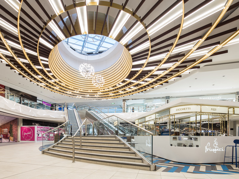
From our perspective as ceiling specialists, the first thing to notice is that the ceilings tend to be regarded as design features in their own right. Traditional CAT A office fit-outs treat ceilings as backgrounds: highly functioning but understated white templates.
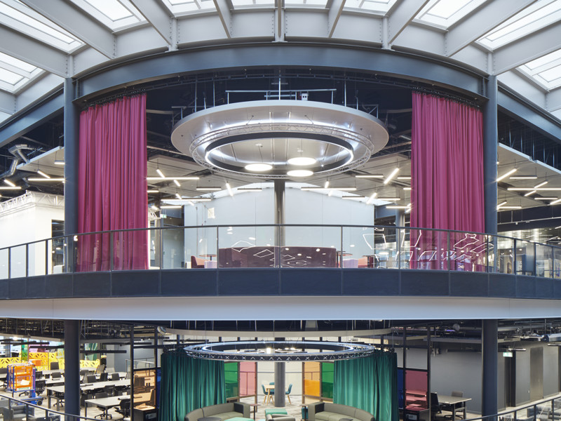
In the fast-moving world of TMT, where space needs to be reconfigured at a moment’s notice as young organisations develop and where contemporary culture is part of the offer, exposed semi-industrial design is in great demand.
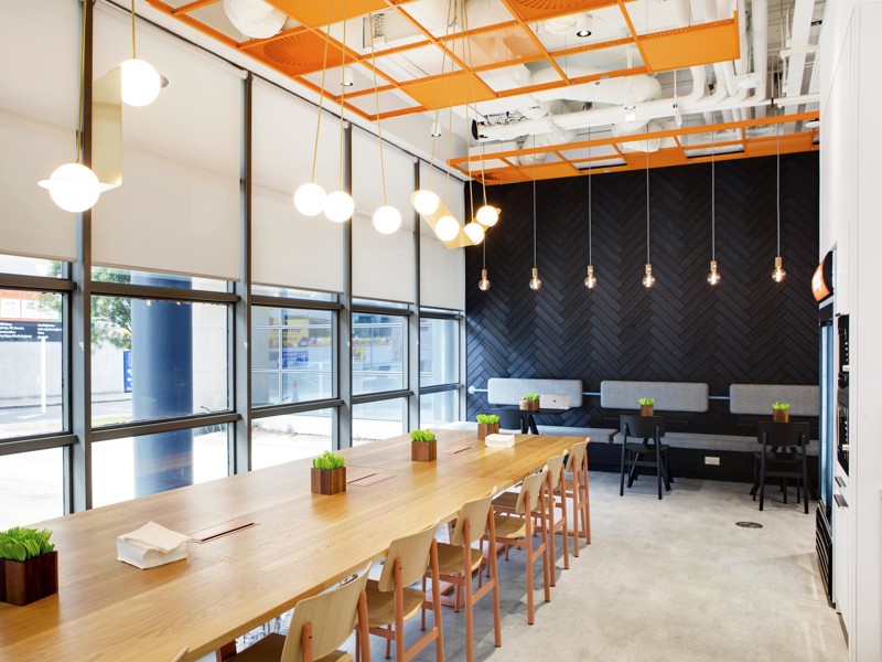
Combining this contemporary raw aesthetic with practical functionality is the trick and the best solution is an open grid system.
This provides a functional structure while still retaining the essence of an open ceiling design. It serves as a base template from which to suspend partitioning, lighting and decorative rafts.
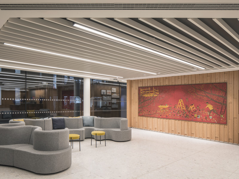
Coloured rafts are an excellent way of defining space without creating barriers. A suspended raft, mirrored by a similar defined space in the floor covering, will create a distinct space that may have a particular purpose. In the BBC offices in Cardiff, for example, studio space is defined by suspended baffles on the open grid ceiling with furniture and flooring defining the space at floor level.
Such rafts provide endless aesthetic design potential but should also be considered as part of an acoustic treatment for the space. Acoustic performance is one area that really suffers when traditional ceilings are removed and we would always advise the input of an acoustic expert in an open-plan office design.
Landlords looking to attract tenants from the TMT sector are reconsidering the level of fit-out required – providing a basic grid ceiling allows the incoming tenant the freedom to create their highly individual culture and is likely to be a positive selling point for the space.
For us at SAS, working with this emerging market sector gives a whole new set of design challenges. Our first forays required a great deal of bespoke design work, but as we have standardised our open grid system, we are now able to cater for creative and utterly non-standard interiors without such demanding design input.
It’s an invigorating world but it’s not for everyone. It would be hard to imagine a corporate law firm embracing the playfulness and informality of this type of interior. We are still very confident of a market for the elegant understatement of a sheer white ceiling while being more than happy to provide the technical expertise to bring some startlingly creative concepts to life.

